Services


Professional content writing services
From blogs to web copy, white papers to technical, Katie Lingo's professional content writing services are here to help.
So, you know you ‘need’ content but you’re not sure where to start. That’s fair. It’s a pretty catch-all term.
Whether you need a content strategy from scratch or just to outsource copywriting services, we have you covered. Our focus is on the written word but we all know there’s much more to it than that. You can have presentations, workshops and editorial calendars, too.
Have a scroll through our content writing services and see what works best for you. And if there’s anything you need…just ask.
Talk to us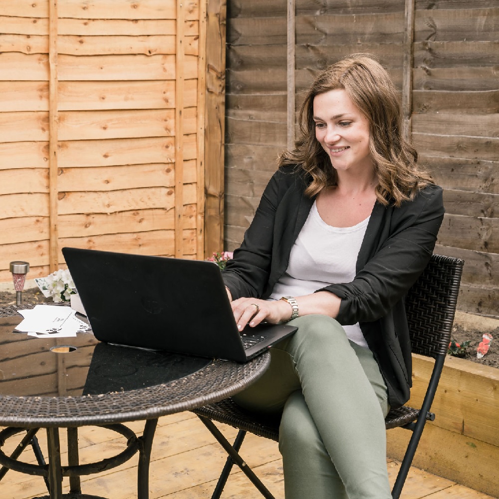
Online content writing freelancer
Online content takes a huge number of forms, from SEO content writing services to cat videos. As UK-based content writing freelance writers, we’re better with the former. If you’re not sure what you’re after, you might be interested in one or more of these:
Website copywriting
Copywriting – not copyrighting – is all about using your words to sell products. Website copywriting might include category pages, hero banners or product pages. Anything that compels the reader to act. If your website needs the blanks filled, get in touch.
Blogging
This is where the ole content writing versus copywriting debate comes in. Blog writing may not always be about selling – it could be to spark debate, to inspire or simply educate readers. Whatever your purpose, you’ll need strong research that meets Google guidelines. More importantly, it meets users’ needs.
White papers
So you want to go in-depth. We’ve got you covered. While we love a good blog, sometimes, you just need to tell more of a story. That’s where white papers come in. Explore a topic in detail or get to the nuts and bolts…just tell us what you’re looking for.
Technical writing
There’s no hiding it. We also love to get techy. If you’re looking to demystify your technical content and provide your readers with clear, useful, practical info, get in touch. From user manuals to technical content writing, let’s strip away the jargon and get your message across.
Content strategy
Like football, content strategy isn’t life or death. It’s much more important. For maximum impact, you need to consider timing, themes, user intent…sounds a bit of a faff, doesn’t it?
Let us get involved. This is ideal for small businesses but it works well for agencies too – let’s say if you’re working with a new brand, for example. So, what does a Katie Lingo digital content strategy look like?
1. Brand discovery
Think of it like a Tinder profile. We want to know what you’re all about and where you want to be. Less swiping; more target audiences, unique selling points and user goals.
2. Channel selection
We’ll look at what you’re using right now – let’s say social media, SEO, PPC – and decide how to put it into practice in future. If you’ve not tried anything, that’s fine too. Our focus is on content, but we can recommend some superstars for paid ads or social media.
3. Editorial calendar
Less yapping, more doing. Here’s where the ‘cunning plan’ comes to life. We’ll plan out an editorial calendar looking at key events, what your content should achieve, and which formats are best. A blog post for May. An infographic for June. That sort of thing.
4. Content strategy review
Finally, we measure and refine, scheduling regular reviews and coming up with new ideas. It’s all about being original. Hackneyed listicles are not our bag – you’ll get fresh concepts, but also useful, persuasive evergreen content.

Print media
There’s nothing quite like the smell of a new book, is there? What about the feeling of your words coming to life on a page? Print media is certainly not dead – and whether it’s a whitepaper, magazine feature or poster, you can still find us for the words.
Magazine journalism is sort of our bag
It all started back in the day when Katie trained with the National Council for the Training of Journalists. Even as recently as 2012, she was writing for printed magazines – and trained as such. That means if you’re looking for hard-hitting feature writing, you know where to go. Interviews, extensive research and emotive language all come as part of the package.
Take your digital marketing offline
While we might be looking to serve the Google gods, there’s nothing stopping us from unplugging. Whether you’re attending a trade show or dropping off leaflets, we’ll write the copy. Complement your existing content marketing with banner wording, flyers, even business card slogans.
Get your name out there
You’ve nailed it. So why not shout about it? If you want your name to appear in the right publications, it all starts with a press release. Not to harp on, but we’re trained in this sort of thing. Cut the waffle and get a clean, crisp press release with all the relevant facts.
Dig a little deeper with whitepapers
Whether in print or digital, white papers show others you’re the real deal. Show off your knowledge and expertise with this long-form content. In the past, we’ve worked with brands such as Reuters to interview stakeholders, gather facts and put them all together. Just say the word.
Bespoke packages
Can’t decide? Ask us about our digital marketing packages. Go full Neapolitan with a little bit of everything – perhaps you want a phased approach starting with a content marketing strategy. Book a call and let’s go through exactly what you need.
For example, you might like…
Blog post retainer packages
Keep it fresh with regular website content. This is a hit with content marketing agencies – but it can work just as well for your small business. Depending on your sector, we can produce weekly, monthly or quarterly posts. You can check out a few examples here.
Content and social media posts
You’ve got a cracking blog post (thanks) but now you want to shout about it, right? While we don’t manage social media accounts, we’ll certainly write the posts for you – and bolt it on to any content retainers.
Mixed media packages
This one’s great for agencies with an eclectic range of clients. Perhaps you’d like long-form whitepapers alongside blog posts, press releases or landing page content. Let us know what you need and we’ll build you a content marketing package. Retained or otherwise.
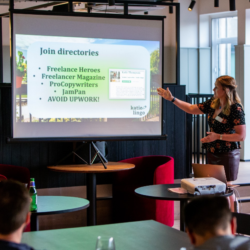
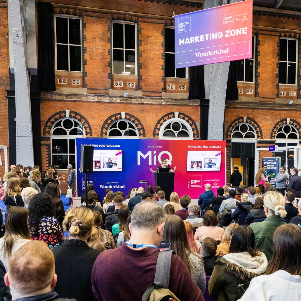
Teaching and public speaking
It’s not always about the written word. Teach a man to fish, they say…put the principles of impactful content marketing into practice with one-on-one consultancy sessions. In the past we’ve spoken at events such as BrightonSEO, Digital City Festival and Leeds Digital Week. Have laptop; will travel. Give us a shout if you want us to come in and show you what’s what.
Keep it fresh.
Content is king, but consistency is key. We could wax lyrical about how consistent content has done wonderful things for us – but it’s best that you see it, too. Whether it’s mixed media or a content marketing retainer, we’re ready for you.
Why hire a freelance content writer?
Here are the many benefits of outsourcing your content writing to Katie Lingo…
Save time.
No one wants the faff of landing pages and meta descriptions. Let us do the heavy lifting.
Find your sparkle.
Never be without ideas again – comprehensive content strategies with user intent in mind.
Mix it up.
Retainer content, ad hoc assignments – scheduling is never simple, so we’ll work around you.
Stay on the treadmill.
Consistent content produced by marathon runners, trained journalists and content marketers. We’ll keep you going.
Tricks of the trade.
Want to learn how to do it yourself? One-on-ones or keynote sessions on awesome content.
Service with a smile.
Think of us like your workplace BFFs. The work is professional but the giggles come free.