The Case for Camels: What Is Accessibility in Copy?
It was a cheeky homemade video that inspired this week’s #Write52 post on accessibility – among other things.
While some laughed at my feeble Love Actually reconstruction, another remarked: “All I could read was ‘big kiss’! Sorry Katie!”
In hindsight, that was some pretty tiny copy. Not to mention some godawful handwriting. Either way, it got the old noggin pondering accessibility in the 21st Century. I decided to educate myself with some tips from the experts – let’s hope there’s something in it for you, too.
Accessibility: then and now
Having worked with Deafblind UK since 2016, I’m used to seeing my copy in ‘accessible’ fonts. In days gone by, this would have meant large print or Braille in printed publications.
Then the internet came along. Now, we throw around terms like ‘camel’ with gay abandon, and just when we think we’ve appeased the Google gods, they throw us a user experience curveball.
Understanding the term ‘accessibility’
Contrary to popular belief, accessible content isn’t solely for the sensory-impaired. As Clare Wilson at Booking.com puts it, accessible content is for everyone.
Certainly, some adjustments will make life easier for disadvantaged readers, but it goes beyond that. We can see digital accessibility in action with W3C’s Web Accessibility Initiative.
Why do we need accessible copy?
Accessible copy will reach the widest audience possible – thereby increasing our conversions. Consider:
Sight impairments and ageing populations
By 2030, 64 per cent of UK adults will have some kind of visual impairment. By 2021, four in 10 of us will be aged 50 and up. That’s a huge demographic to miss if your copy is inaccessible.
Cross-device reading
You don’t need me harping on about the importance of mobile in web design. Your copy should be large and interactive enough to render on all devices, large or small.
Replacing lost information
How many times have you seen an image fail to load, or been irked by a buffering video? Simple additions like captions and alt tags will get your message across – even if your media fails you.
 Giving instructions
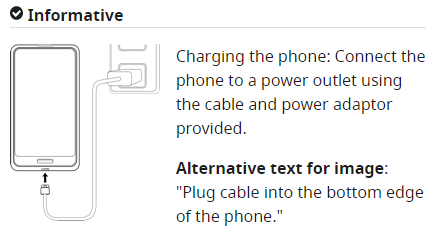
Bear in mind that viewers may be using screen readers. In this helpful illustration from W3, we see a diagram of a phone charger. The alt text is hidden to the naked eye, but screen readers will pick this up. Your copy should tell the reader exactly what to do.
Putting accessibility into practice
So now you know why, but do you know how? Whether it’s video, written content or simple SEO, you can use these housekeeping tips.
Make way for the camels
There go those bloody humps again. Special thanks to Simon Fairbanks at Pickle Jar Communications for the introduction to this term!
In the coding universe, you may have heard the camelCase vs PascalCase argument. The former is commonplace in brand names, starting with a lowercase letter followed by uppercase to mark a new word. Think easyJet, for example. It also looks a little bit like a camel.

PascalCase, used for brands like MasterCard, uses initial caps. This helps screen readers to dictate each word correctly – or avoid social faux pas with hashtags. Thank you for the Susan Boyle reference, Simon!
Tidy up your on-site SEO
You’ll find headings and page descriptions in SEO 101, right? You’d be amazed how often they’re overlooked.
When structuring blog content, stick to hierarchical heading structures. Your page title should be the H1 tag, and then any subsequent headings should follow a H2/H3 etc. structure. So, if you have a topic within a topic, structure it thusly:
10 Reasons My Cat Is Awesome (H1)
- He can perform loads of tricks. (H2)
- He can tie his own shoes. (H3)
- Yes, I know what you’re thinking – but those tiny shoes were on sale. (Body/paragraph copy)
- He can tie his own shoes. (H3)
If you’re pasting from Word straight into a CMS, just highlight the text and click ‘Heading 1’ etc.
Make your page titles consistent
These will appear in tabs on your browser, so they need to be two things: distinct and consistent.
Sorry? Use relevant keywords to describe each unique page (such as with a Yoast plug-in) but keep the styling consistent. You might use piping | followed by your brand name, let’s say.
If there’s a user journey, like a transaction, make sure you label each step in the page titles.
Turn long paragraphs into bullet points.
With up to 80 per cent of readers skim-reading content (eeep), sometimes, it’s better to summarise. You wouldn’t write a recipe or a list-of-reasons-why-your-cat-is awesome in one sprawling paragraph. Help your reader navigate with bullet points.
Bonus points if you can make each point progressively longer or shorter than the last – but don’t write a whole paragraph!
Give anchor text and calls to action context.
In another great example from Booking.com, Clare Wilson navigates us through the booking process. Screen readers could confuse your customers if they hear the words ‘next step’ on every subsequent stage.
Instead, tell them what the button will do, e.g. Search > Choose your room.
The same goes for anchor text. Replace copy like ‘click here’ with a benefit. In W3’s example, we have:
For more information on device independence, click here.
Vs:
Read more about device independence.
Even better, clear calls to action can increase conversion rates.
BUT…remember…
If your call to action isn’t part of a journey, then keep it consistent. You may confuse visually-impaired readers if you use ‘contact us’ on one page and ‘email me’ on another.
Tag up rich media
Contextualise your images using the media library in your CMS. For example, in WordPress, you can click ‘add media’.
Here you should see fields to add information, including alt tags. Use a clear, concise description of the image to help visually-impaired users.
Likewise, with video, you can add alt text and/or subtitles. Try Facebook’s auto subtitle generator or LinkedIn’s alt text option. You can also add subtitles manually if you have a video editing tool. There’s no shame in using iMovie.
Word of warning: don’t confuse accessibility with readability
Accessible text is readable, but readable text isn’t necessarily accessible. Once you’ve followed these tips, don’t discount the content! Use tools like the Hemingway App to look out for:
- Complicated words
- Long, meandering sentences
- Adverbs – sometimes, you need a stronger verb.
Keep paragraphs to a maximum of three sentences if you can. All you need is an idea, supporting argument and conclusion.
Remember, accessible copy is for everyone. Use the Flesch Reading Test to identify polysyllabic words or marathon sentences. The boffins on my NCTJ course advised no more than 25 words, but even that’s a stretch for web copy.
How does it sound?
Having trouble visualising all this? Listen aloud instead – you can try one of these free screen reader systems or add this Chrome extension.
The takeaways
TL;DR – you’re skipping to the end anyway, right? If you want to engage with the biggest number of users possible, remember to:
- Make copy readable to screen readers
- Adhere to SEO best practices
- Describe your content
- Use clear language
- Be consistent.
Nobody wants to struggle to read your content, so be a sport. Make it accessible.
Browse more on our blog or explore content writing services.


2nd September 2020